Brainstorm:
I drew up a brainstorm for my notes about the different shaped packaging products I will be constructing for this activity.
Here are 3 images that represent each piece of packaging and my intended plan for the shape of the product:
left to right: Wrap-Around, Cylinder, Cuboid
Here are my initial sketches for my 3 nets:
Building the Nets:
Cuboid:
I began my net by drawing out the rectangles using the shape builder tool. The angled edges were made using the white arrow tool.
ROUND CORNERS: To get rounded edged on my tabs I placed a circle in the corners and added points using the pentel from the box and removed 2 points at the corner. I then used the path finder tool to 'unite all'
Net so far with the rounded corners.
Now that all the sides are in I needed to 'unite all' with the pathfinder and add dashed lines that will show which lines will be folded while the solid line shows where to cut.
Next I added a bleed using the 'offset path' function - this will show me where to place my design so that when I cut my net out it will have colour going right over the edges.
Next I added the margins to tell me where to put my design so that it fits on the sides comfortably and neatly.
Finally, I added the crop marks to help me to cut out my net accurately.
Cylinder:
As the net for the cylinder is a long rectangle that will wrap around a bottle it was very quick and simple to build the net. I just used the shape builder and line tools to draw the crop marks, margins, fold and cut lines.
Wrap-Around:
To build the net for my wrap-around net I used the shape builder and pentel tools to construct the shape onto the grid. The oblong shapes allow the plastic tub to sit securely in the net.
I used the pathfinder to unite the shape.
Then I added a bleed, crop marks and fold lines to complete the net.
Initial Designs - Cylinder Surface Graphics (Pink Lemonade)
Before I start thinking about the layout of the graphics I sketched a few visuals related to the subject of my brand 'Joey's Carnival' so I drew things like roller coasters and skates and my product 'Pink Lemonade so I drew some lemons, flamingoes and lips which is what came to mind when I thought about the product.
Then I sketched some different layout options and developed them to a stage I was happy with to take onto my net on the computer.
Development of Cylinder Surface Graphics (Pink Lemonade)
I made this striped pattern using the shape builder tool and changed the colour to pink to fit with the product of pink lemonade. I went with the striped pattern because it is a common pattern for carnival themed graphics.
I placed the pattern into my net.
I made this logo for my brand and product and looks like a packaging sticker. I have used two fonts that remind me of fun fairs/carnivals to be cohesive with the brand.
I added a nutritional information box I found from the internet
I didn't like the font and heaviness of the nutritional information box from the internet so I made my own with a lighter stroke on the letters and line. I also put the barcode, recycling symbols, best before date and smaller logo next to it to keep the information in chunks - this will make it easier to read as the customer looks around the label.
For the rest of the packaging I decided to have two of the logos so that it is more visible from all angles. I have made the text boxes into 'ticket' shapes and written some facts in them.
Finally I added an ingredients box and carnival elephant vector that I got from the internet (if I have time I will be replacing that with one of my own drawings)
Screenshots of net in Illustrator showing the layer pallets.
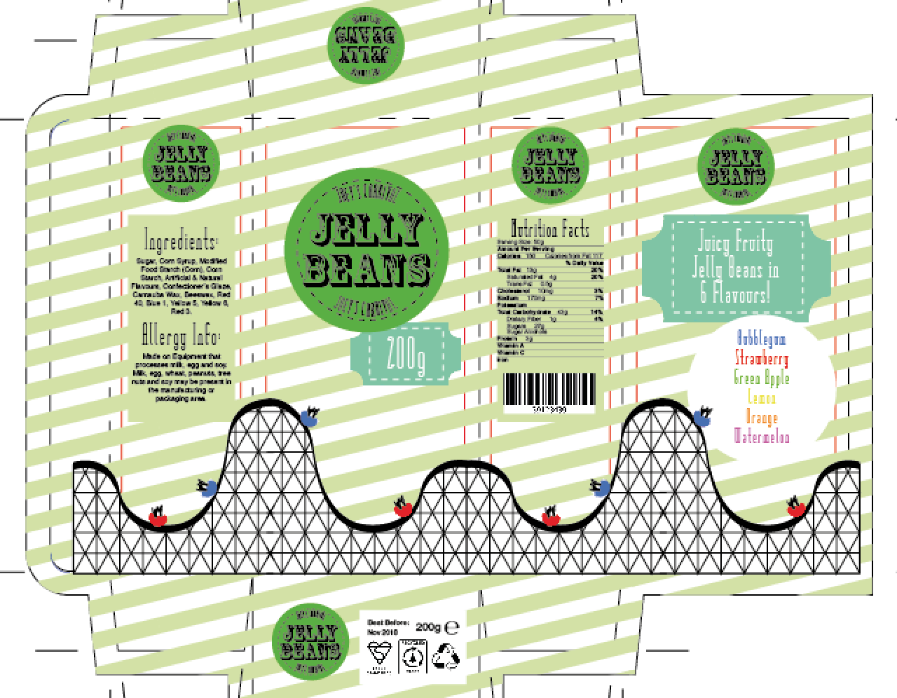
Initial Designs - Cuboid Surface Graphics (Jelly Beans)
Again I sketched out lots of visuals related to Jelly Beans and Carnivals to get some inspiration for my surface graphics designs. I drew a lot of parrots because they are multi-coloured to represent the many colours of jelly beans but it doesn't really fit in with the theme of the brand (carnival)
Then I sketched some different layout options and developed them to a stage I was happy with to take onto my net on the computer.
Development of Cuboid Surface Graphics (Jelly Beans)
I started by placing the stripe pattern over the net and changing the colour to yellow
I then added the logos to each side of the box - I learnt when looking at packaging that it allows the customer to view the logo from however the box is placed on the shelf.
I drew out a roller coaster using the paintbrush and pentel tools. The carriages on the roller coaster are jelly beans to show the customer how much fun the product is. It also relates to the carnival theme of the brand.
I decided to have the roller coaster go all around the box to be interactive for the user.
I added the barcode, recycling symbols and weight to the base of the box - out of the way from the design elements around the sides of the box.
I changed the colour scheme to green as the yellow and pink felt a bit too girly and I wanted to use two shades of the same colour.
I also added the nutritional facts and barcode to one of the sides.
I then added the ingredients box and a tag line on the back that describes the product.
Again, I changed the colours to be lighter so that the background wasn't too overwhelming.
I also added a flavour menu on the back and changed the background colours of the nutrition and ingredients boxes to blend into the background.
Screenshots of net in Illustrator showing the layer pallets.
Initial Designs - Wrap-Around Surface Graphics (Tub O' Brownies)
Again I sketched out lots of visuals this time related to Brownies and Carnivals to get some inspiration for my surface graphics designs.
Then I sketched some different layout options and developed them to a stage I was happy with to take onto my net on the computer. I didn't do as many sketches as with the others as they all have a similar layout I want to keep to get a cohesive look.
Development of Wrap-Around Surface Graphics (Tub O' Brownies)
For the wrap-around packaging I made the colour of the stripes blue.
I made the logo a darker blue and the font white to make it legible against the blue.
For the front side of the wrap around I added a 'ticket' shaped box with a description of the product.
This is the side that will be visible when it is sat on the shelf so it is important for the customer to understand the message.
For the base of the wrap-around I decided to put the nutrition facts, bar code, recycling symbols and best before date to keep it out of the way of the design so that it looks more attractive.
I placed a vector of a merry go round I got from the internet - again - if I have time I will be replacing this with one of my own drawings. I also added the same image to the back and changed the text box to show the ingredients of the product.
Front Back
Screenshots of net in Illustrator showing the layer pallets.
EVALUATIONS:
EVALUATION: CYLINDER NET & SURFACE GRAPHICS (PINK LEMONADE)

My pink lemonade packaging works well because it utilises the whole space to display all the vital information. I separated the space into sections so that the customer doesn't have to rotate the bottle to read a paragraph of text. It also allows the logo space to leave an impact and not be too crowded for the customer to understand. I have a coherent theme across the whole label (carnival) so that it creates a feeling or emotion for the customer to think they are buying an experience rather than just a drink. The image of the elephant does however feel a bit random at first glance as well as it not being my own work so I would like to exchange it for one of my drawings in my initial designs.
The turquoise ticket shaped boxes distract a bit from the logo which would decrease the impact of the product name and therefore may reduce sales. I think the pink stripes need to be in a lighter colour to not distract from the content of the label but I think overall it is a fun and inviting background for the bottle. I put the logo on twice so that it could be visible from multiple angles that the bottle is placed. The net is a very basic rectangle that meets and glues with the tab on the right.
In conclusion, I think that my label works well to have a clear brand identity and an inviting colour scheme. I think it would also successfully attract customers with the bold product name and informative text boxes. If I could improve the label I would tone down the background, make the 'Joey's Carnival' text bolder, and replace the elephant with my own images.
EVALUATION: CUBOID NET & SURFACE GRAPHICS (JELLY BEANS)
My jelly bean, cuboid packaging follows the same design style as with the pink lemonade to be coherent with the brand identity. This time I have an image of a roller coaster which I made in Illustrator - the carriages are jelly beans which I think would make children want to buy the product as it looks fun and exciting. I think the light green works well as the background with the darker green logo (this makes the logo stand out more than with the pink lemonade combination) I think putting the recycling symbols and best before date at the base is suited the target market of children as they will want to see the design and not any 'boring' parts. Having the flavour menu on the back allows the customer to choose what flavour they want and is a fun feature to have with the different colours.
I have put the logo on each side of the box so it can be viewed no matter how it is placed. The legal requirements of the nutritional information and ingredients can be found at the sides of the box which allows the back to have a design - however, it does mean that if the box is placed on the shelf sideways it doesn't give a good representation of the product. The net is a pretty basic cuboid shape that has strong tabs that will keep the top and bottom closed and only has one glue tab to be environmentally friendly.
Overall, I think it is an engaging and fun design that would entice children to ask their parents to buy the product. It has an evenly spread layout that has all of the necessary information a customer would want on the box - however, I think the roller coaster is a little to heavy with the black lines and distracts from the logo - it could also have larger images of jelly beans as that is what is inside the box so customers may not be as attracted to the box on a shelf full of other sweets.
EVALUATION: WRAP-AROUND & SURFACE GRAPHICS (TUB O' BROWNIES)
I have continued the design style again for my tub o' brownies, wrap- around packaging. I chose to put all of the legal requirements at the base of the box to keep the design looking balanced and simple as the packaging could be placed on the shelf in any position so this design has the same look on both sides. I have put an image of a merry-go-round on the net which I got from the internet but if I had more time I would, again, use some of my own drawings. I have used this image because of the link of carnivals to the brand and also the shape of the box is round like a merry-go-round. I have put information in the ticket-shaped boxes to blend them in with the design so that they look more attractive.
There is a lot going on with this net but I think it has been evenly spaced throughout the net and would look attractive and inviting to the target market of families with the bright colours and fun images. The net wraps around to meet at the back of the top and the cut out holes allow the box to be secured in the net. I think that the net looks unique but would work practically to contain the contents which makes it fit for purpose.
Overall, I think this is a fun, friendly and well organised piece of packaging - however, it doesn't lend itself much to the actual contents of brownies. It doesn't have any images or colours that look like brownies and so the customer may not immediately know the contents.